HOW TO BE TRUSTWORTHY
CLIENT
Block Party
ROLE
UX Researcher
TIMELINE
10 weeks, Jun–Sep 2024
METHODS
Contextual inquiry, think-aloud, surveys, affinity mapping
IMPACT
Shipped conversion infrastructure that Block Party still uses
Designing a mobile bridge experience that builds user trust and drives conversions for a desktop web extension.
THE COMPANY
THE PROBLEM
I joined as the only user researcher on a team of fewer than ten, reporting directly to executive leadership. This meant setting processes from scratch, with real influence on company decision-making.
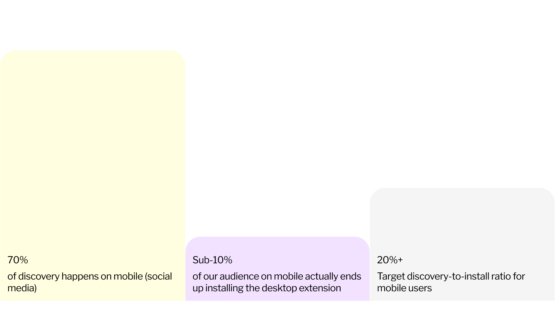
I started by auditing the marketing funnel through Mixpanel. The data revealed an immediate tension: 70% of product discovery was happening on mobile via social media, but fewer than 10%* of those mobile users ever installed the desktop browser extension. The target was 20%+.
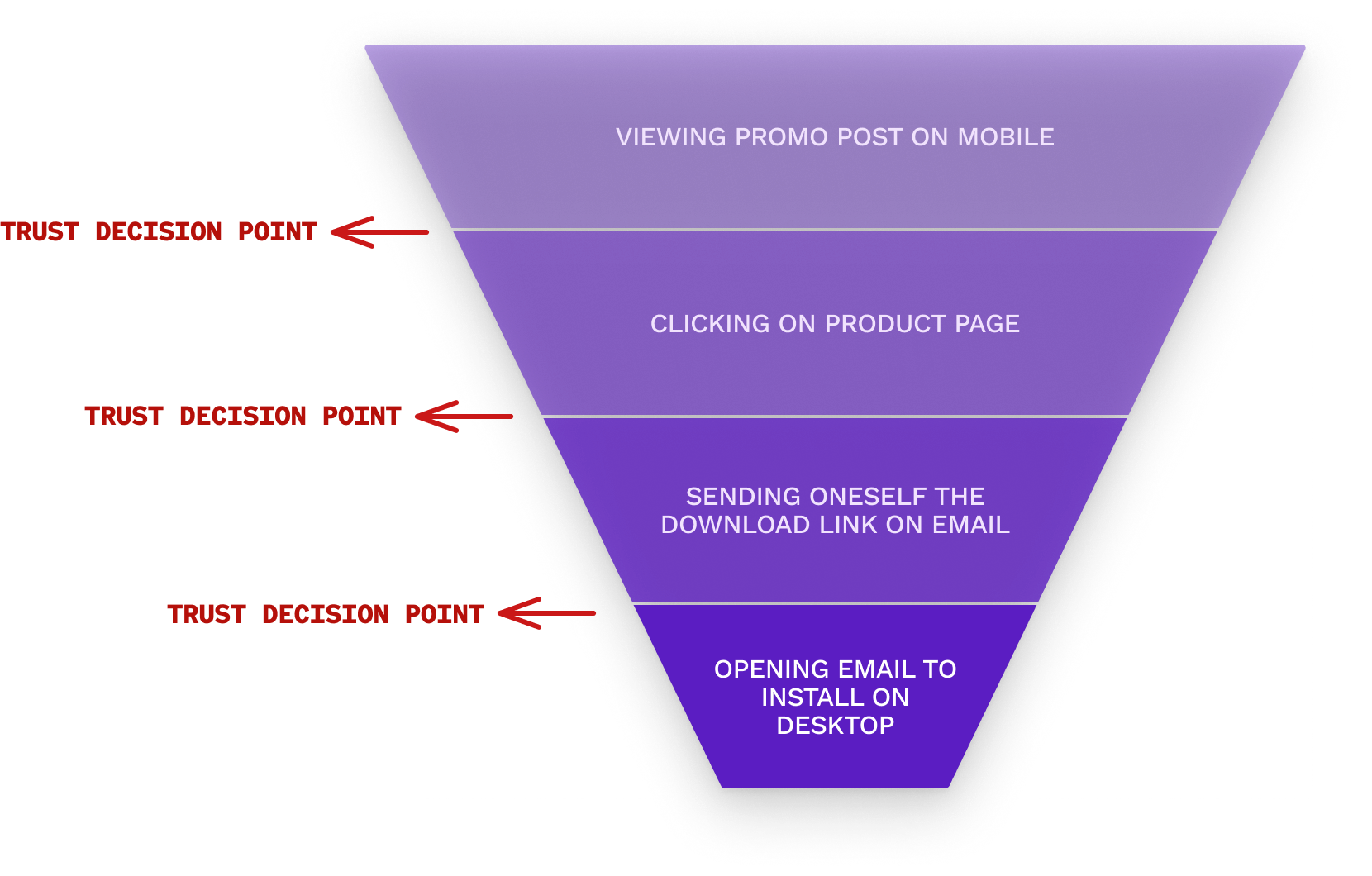
The funnel itself was convoluted. A user would see a promotional LinkedIn post on their phone, click through to a product page, encounter an "Add to Browser" button that doesn't work on mobile, get redirected to email themselves a download link, then need to remember to open that email later on desktop.
I mapped dropoff at every stage. But metrics could only tell me where users were leaving, not why.
*these numbers are made up, to protect company confidentiality
THE REFRAME
To understand the why, I designed a qualitative study around a dual research question:
Why do users abandon the funnel? + What could motivate them to stay?
The emergent insights reframed each dropoff point as a trust decision point. The conversion flow didn't do a good enough job of convincing people that our browser extension was trustworthy.
STUDY 1: THE MARKETING FUNNEL
RESEARCH QUESTION
Why do users abandon the funnel, and what could motivate them to stay?
METHODS
I designed a 30-minute protocol combining three approaches:
Method · 5 min
Mixed qual and quant survey
Understanding participants' pre-existing mental models around social media and privacy, to contextualize their funnel reactions.
Method · 15 min
Contextual inquiry + think-aloud
Observing real-time, unmediated responses to the marketing funnel.
Method · 10 min
Follow-up interview
Clarifying observations and exploring motivations further.
PARTICIPANTS
Five sessions over five days, three in-person and two remote. I recruited LinkedIn and Twitter users who had never used Block Party, deliberately selecting for diverse mental models: people who ranged from privacy-anxious to privacy-indifferent.
LIMITATIONS
- •Recruiting scope. Without a compensation budget, I recruited from my immediate network, deliberately selecting people at opposite ends of the privacy-concern spectrum to maximize relevance within the constraints.
- •Timeline. One week meant I couldn't build depth through multiple interviews per segment, but the tradeoffs were necessary to actually affect design outcomes.
ANALYSIS
Sessions were recorded via Zoom and Voice Memos, transcribed through Grain, and synthesized through affinity mapping to surface overarching themes — both page-by-page and across the full journey.
WALKING THROUGH THE FUNNEL
I started each participant with a LinkedIn post from Block Party's founder, tailored to whatever privacy feature they'd expressed the most interest in. I watched whether they'd click through organically before prompting.
- Step 1Promotional post on mobile → Decide whether to click
- Step 2Product page with "Add to Browser" CTA → Can't install on mobile
- Step 3Modal: "Email yourself an install link" → Trust barrier
- Step 4Switch to desktop, open email → Friction point
- Step 5Chrome Web Store → Final install
FINDINGS
Users don't trust what they can't try.
The underlying cause of dropoff was mistrust in browser extensions. People wanted to demo before they'd commit. Being able to experience the product on mobile, without switching devices, would give them the activation energy to actually install.
A secondary finding: unclear product messaging bred suspicion rather than curiosity. Because they entered the funnel through a post about a specific feature, then landed on a page promising the extension could do "even more," they were left wondering: what else can this extension do?
ENTER: THE MOBILE PLAYBOOKS
My findings helped secure buy-in for the Mobile Playbooks Experiment — originally scoped as simple resource pages, but significantly shaped by my research. I co-owned the project with the Head of Design, building it around three core features:
FEATURE A
Step-by-step privacy guides.
As users scroll, each card reveals a privacy setting they can change on a given platform. Crucially, my research signaled that these cards should mirror the visual language of the browser extension itself — so the playbook becomes the demo.
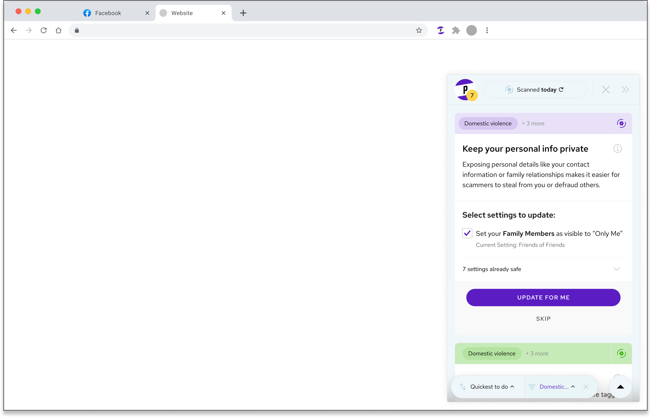
Cards in the demo (right) followed the same visual language as the cards in the extension (left), though they were adapted to fit the new mobile form-factor.
FEATURE B
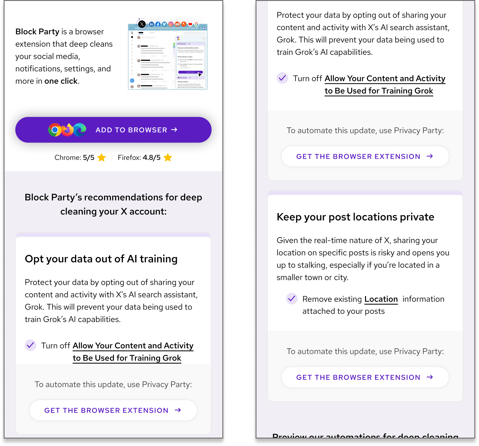
Deep links to settings.
Users can tap any recommendation to jump directly to the relevant setting within the social app. This was initially a debated feature; I advocated for it based on research by showing that reducing friction would improve perceived value and that it would reveal core extension functionality.
FEATURE C
Download CTAs throughout.
By listing the manual steps to change settings, we hoped users would recognize the tedium and be motivated to download the extension for automation. Buttons were placed throughout for easy conversion.
Underlined settings deep-link into each platform, while download CTAs appear throughout to capture intent as it peaks.
STUDY 2: PLAYBOOK VALIDATION
OVERVIEW
Five interviews over three days, plus one day for analysis. Participants were active LinkedIn or Twitter users (the two platforms with launched playbooks). Three tests focused on mobile web experience, two on desktop, covering all primary use cases.
METHODS
20–30 minute in-person sessions. A 5-minute priming interview established participant profiles and mental models, followed by contextual inquiry observing natural interaction with the playbooks.
KEY FINDING
Showing functionality isn't enough.
Just a demo was not enough. Users also don't trust what they do see — unless they know it comes from a reputable source.
Users specifically didn't trust the urgency of the copy; it felt misleading and hurt believability. One participant went so far as to say the page looked like a scam site, citing visual patterns she associated with past phishing attempts.
Additional findings:
- •Readers consistently skipped subheaders — they weren't adding value
- •The "Easy fixes" section was useful for deciding whether to read further
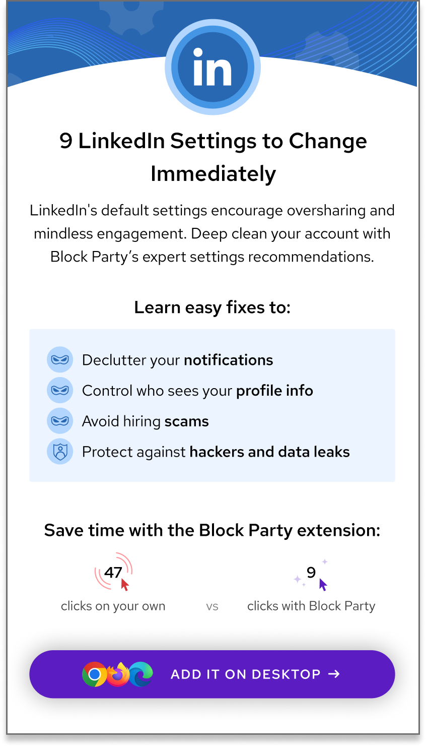
- •The "clicks saved" graphic was confusing to new viewers
- •The "Add to Browser" button appeared too early, before users understood what they'd be adding
DESIGN CHANGES
Based on these findings, we implemented immediate changes:
- •Revised header copy to reduce artificial urgency
- •Removed the skipped subheader entirely
- •Elevated the "Easy fixes" section to the top of the page
- •Replaced the confusing "clicks" graphic with clearer product context
- •Added brand information and product explanation earlier in the flow
- •Included user reviews to establish credibility
Tested prototype
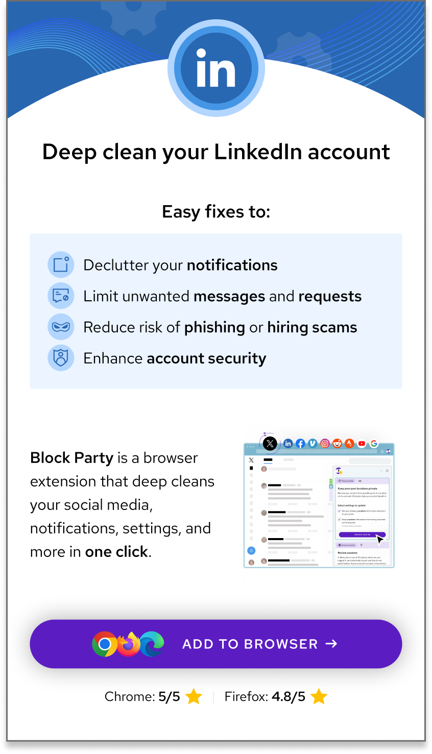
Shipped version, post-UXR feedback
IMPACT
ORGANIZATIONAL
Articulated the core issue. By framing key findings under a common theme of trustworthiness, I gave the team a clear, graspable way to understand the user problem.
Aligned cross-functional stakeholders. My data-driven perspective provided the evidence needed to resolve internal debates about design direction and move forward confidently.
PRODUCT
Directional changes. Study 1 findings helped define which features to prioritize in the mobile playbooks experiment.
Immediate UI/copy improvements. Study 2 insights drove rapid design iteration, focusing on building user trust progressively.
MEASUREMENT FRAMEWORK
% install button clicks per page view
Primary conversion metric
Clicks into specific features
Relative interest in individual recommendations
Relative popularity of install button placements
Where in the journey users decide to convert
ARTICULATING TRUST
Across two intersecting studies, a unified insight emerged: trust is the primary roadblock in user conversion and growth for Block Party's offerings.
STUDY 1
Audiences don't trust what they can't see — so we needed a way to demo the product on mobile.
Outcome
Demo launched.
STUDY 2
Audiences also don't trust what they do see — unless they know it comes from a reputable source.
Outcome
Trustworthiness embedded in design through copy changes, testimonials, and credibility signals.
REFLECTION
This internship taught me how research operates differently at a startup versus a larger organization. With no established UXR infrastructure, I had unusual latitude to shape what research meant for the company — but also unusual constraints in terms of recruitment, timeline, and sample size.
If I were to do this again, I'd push earlier for a small compensation budget to diversify my participant pool beyond my immediate network. I'd also build in time for a second round of validation testing post-redesign to close the loop quantitatively.
What I'm most proud of: reframing "dropoff" as "trust decisions" shifted how the entire team thought about the problem. That conceptual contribution, more than any single design change, is what I hope persists.